
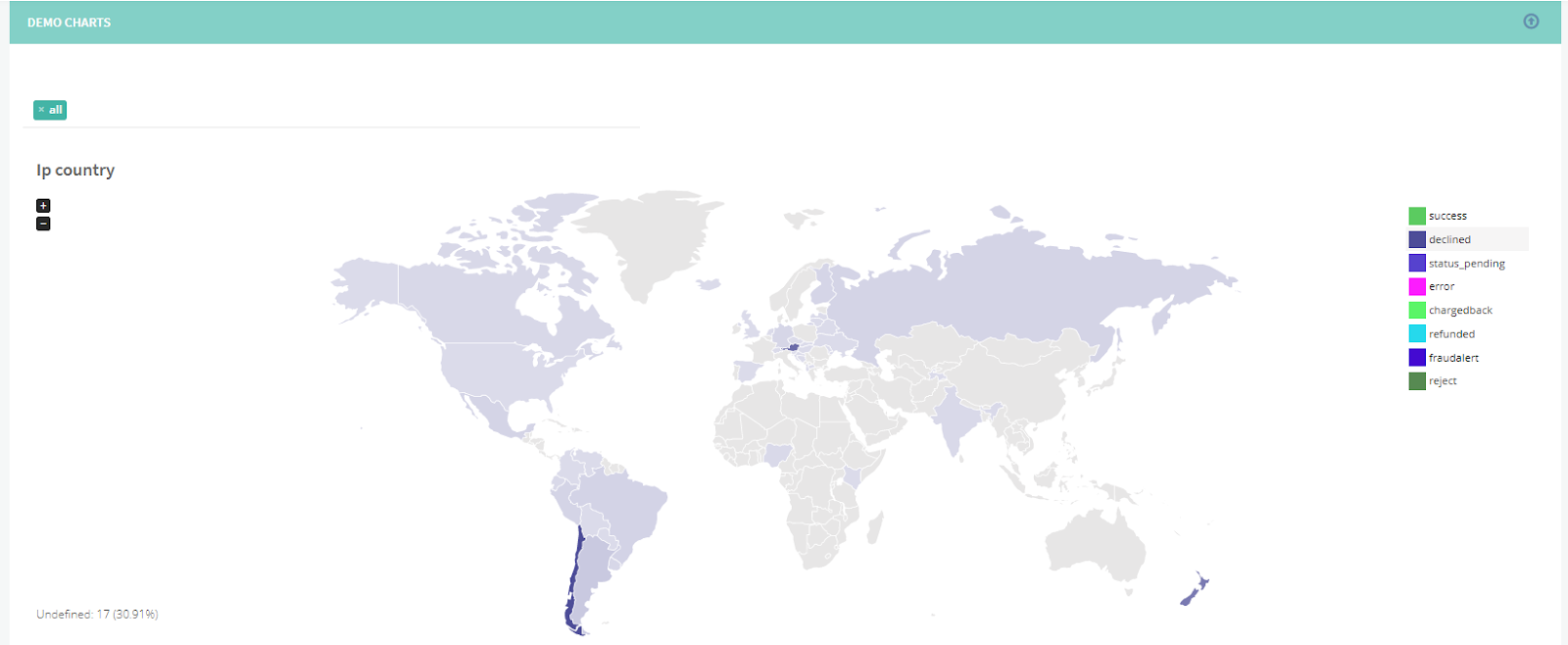
Many customers use the data from Covery to build various graphs and charts to better visually represent the transaction monitoring statistics. We added this functionality by default and will continuously increase the number of charts and diagrams available.
One of the most popular Covery reports provides a multi-faceted analysis of the payments your business received. These can be filtered by various categories.
By country:
- The geographical location the buyer specified
- The buyer’s IP address
- The card’s BIN country, etc.
By merchant information:
- The product purchased
- The website URL, etc.
By traffic:
- The source of traffic (where the customer came from)
- The affiliate ID, etc.
By processing data:
- The payment system used
- The payment method used
- The bank’s MID name
and many, many more.
Previously this data was exported as a .csv file and represented as a table. However, this format is not ideal for many business owners, who need to be able to view the data visually.
Now, various charts can be built for different time periods, for different factors, for different transaction statuses, etc. The filters you apply affect the resulting visuals dynamically.
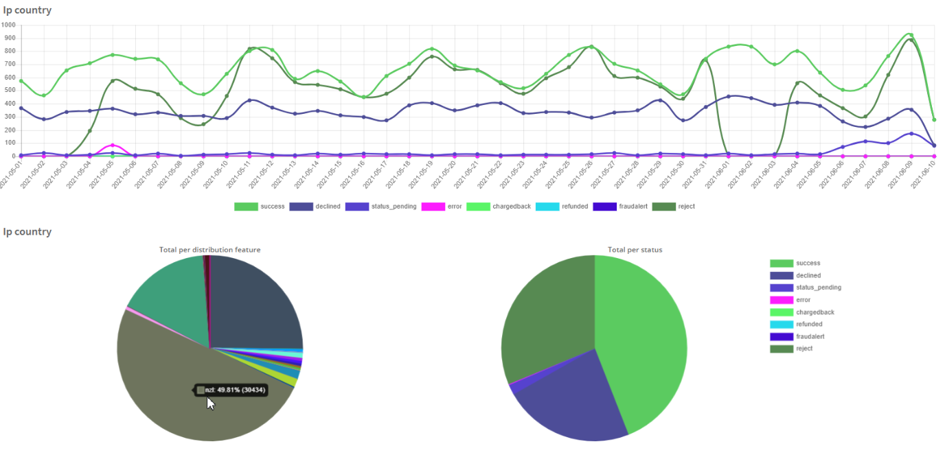
These chart templates can be saved for further use, adjusted if need be, or emailed to a specified email box on the schedule. Feel free to experiment with this new functionality.
Covery persistently works to improve your user experience with our platform.